Challenge
Important products, quotes, and category pathways were competing for space in layouts that either stretched too long or only allowed one piece of content at a time.
Component system
Custom components helped the site hold more strategic content in less space while keeping the experience modern, accessible, and easier to maintain.
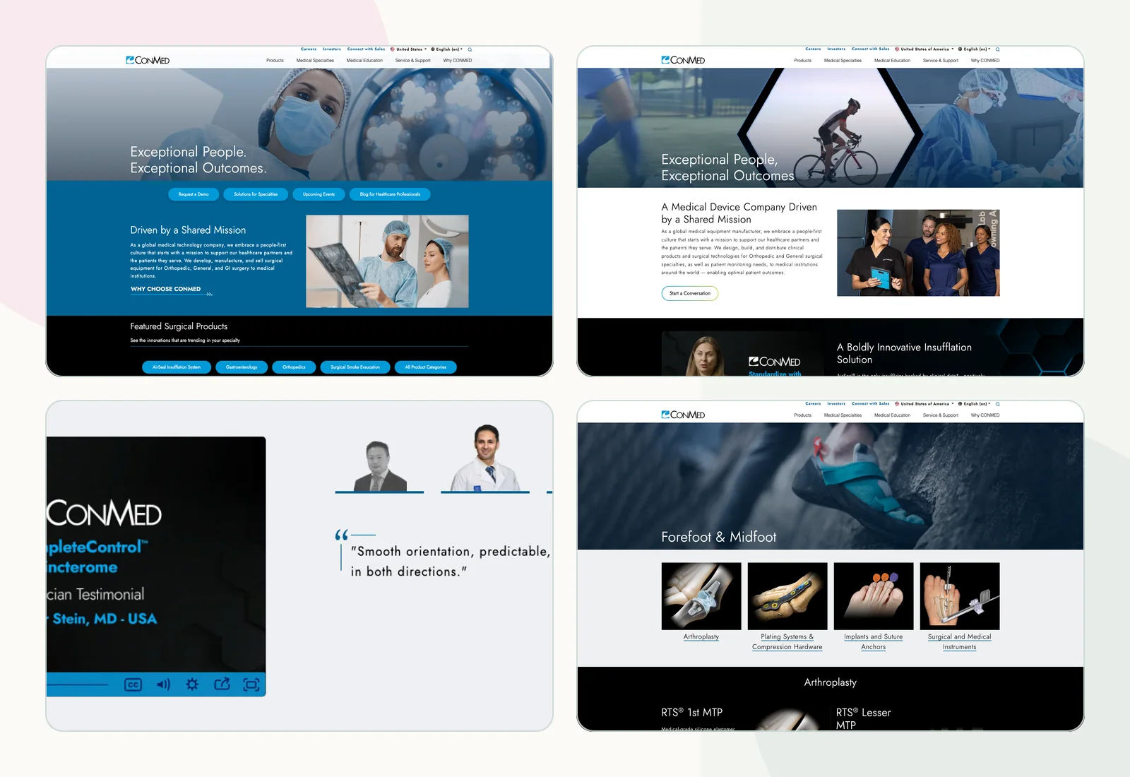
Important products, quotes, and category pathways were competing for space in layouts that either stretched too long or only allowed one piece of content at a time.
Design and develop custom Sitecore-friendly UI/UX components, update homepage and family-page patterns, and maintain the site with SEO, ADA, and CMS reuse in mind.
The component work improved visual consistency, limited scrolling, created more room for product pathways, and gave teams more flexible patterns for future pages.
I created more compact reusable modules, including tabbed product/category areas, tabbed quote content, and two-up layouts that make dense information easier to browse.
Update the homepage structure so more product and specialty pathways could appear without turning the page into a long undifferentiated list.
Create tabbed product/category patterns and quote components that allow multiple pieces of content to share one focused page area.
Lay out content in two-up sections across the site so related messages, products, and calls to action can sit together without overwhelming the page.
Apply the same component thinking to specialty family pages so related categories, like forefoot and midfoot, can be presented together.
Each component is shown as its own artifact so the interface pattern can be inspected without cropping away the details.
A compact product-category component made it possible to feature more solutions on the homepage while keeping the section easy to scan.
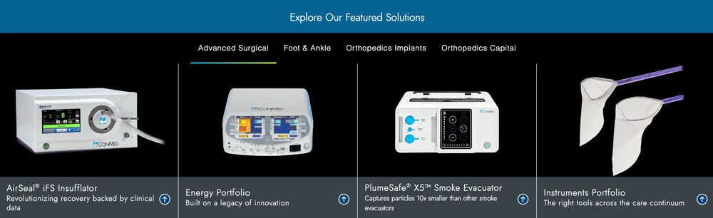
Tabbed 4-up component for switching between product categories without adding more page length.
The quote area evolved from one long edge-to-edge quote into a tabbed module that can support multiple voices in the same footprint.

Tabbed quote component designed to carry more testimonial content in less space.
The two-up pattern pairs related content, calls to action, and promotional pathways without forcing users through long single-column sections.

Two-up layout pattern used to pair related content and calls to action without extending the page.
Together, these new components reduced scrolling by replacing the older long homepage on the left with the current, more compact homepage on the right.
The case-study proof is shown as full artifacts so before and after comparisons stay inspectable instead of being squeezed into decorative thumbnails.
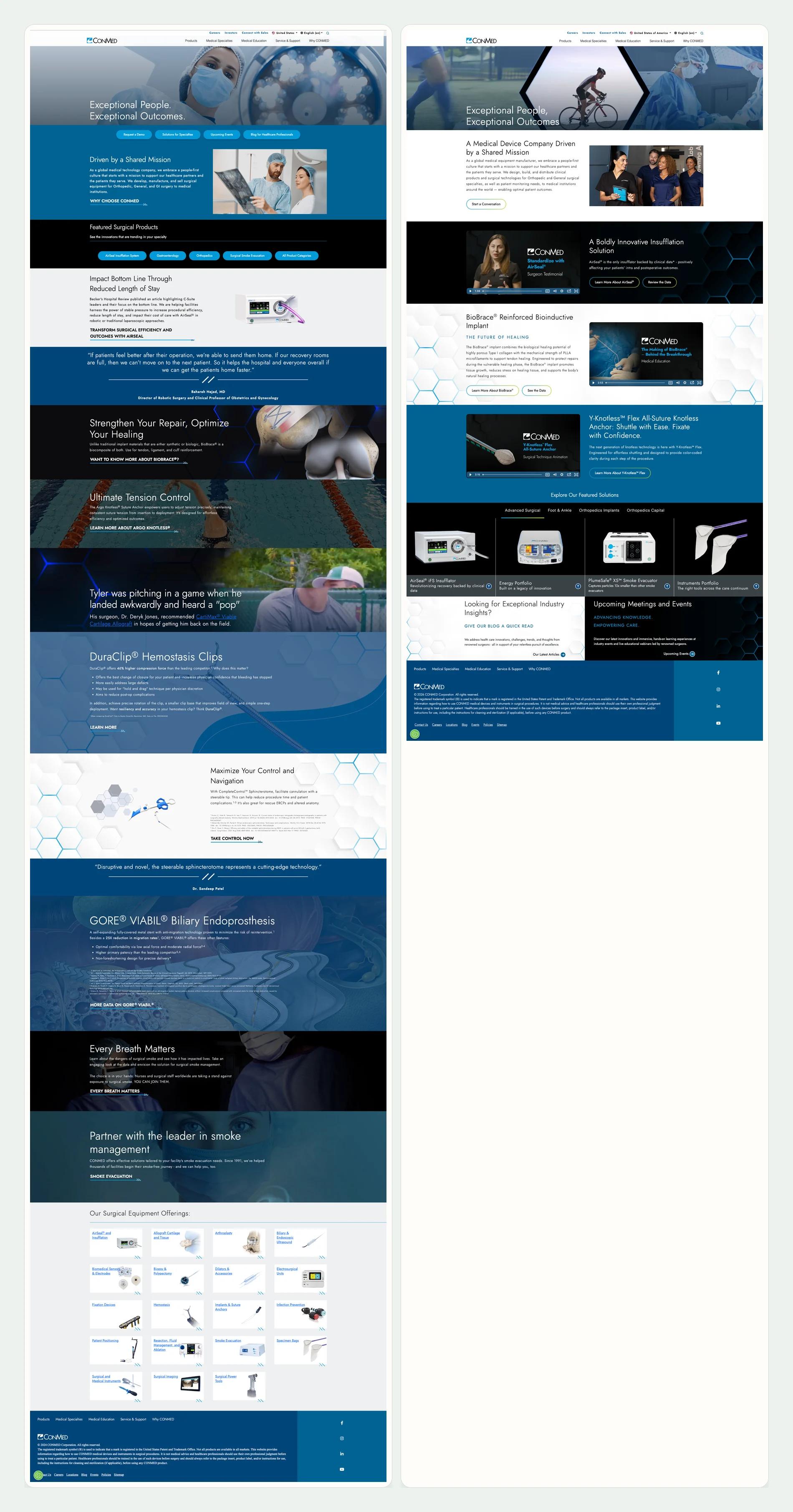
Left: homepage before the component refresh. Right: finished homepage with a more modern visual system, shorter scroll, and stronger product pathways.
By adding a two-up redesign, I was able to showcase more products that should be grouped together, including forefoot and midfoot content that previously lived in a narrower page path.
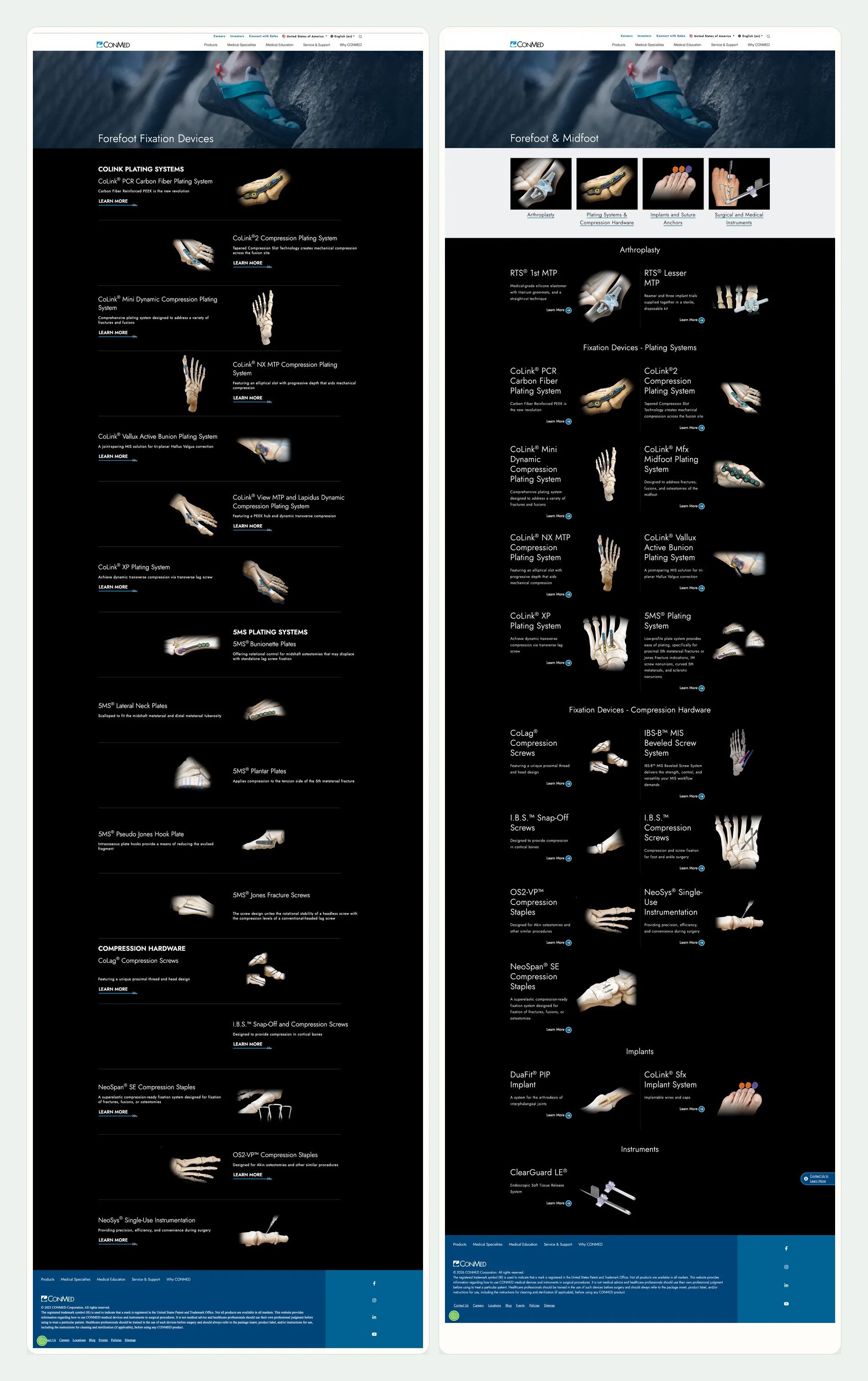
Left: forefoot-only page. Right: expanded forefoot and midfoot family page with multiple product categories in a unified path.